Coastal Grandmother Wall Art for Etsy: The Aesthetic That Keeps Selling
Coastal grandmother is relaxed, timeless, and has buyers with disposable income. What the aesthetic wants and how to create prints that fit it.
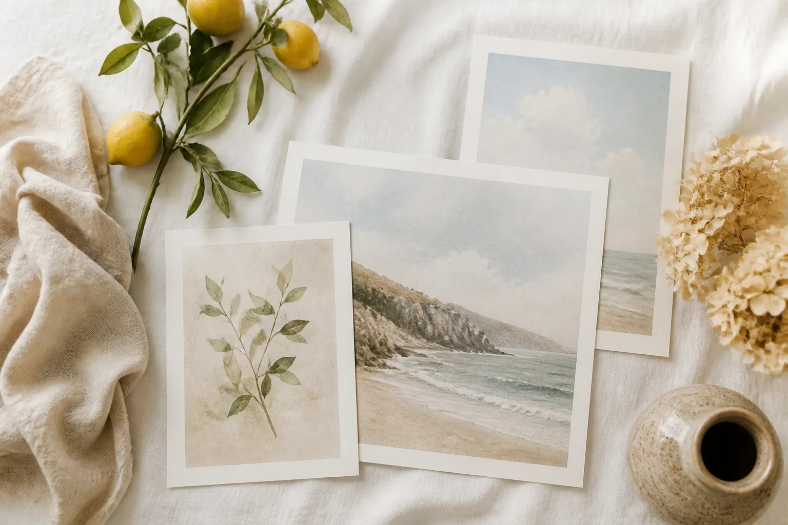
Coastal grandmother isn’t beach-house kitsch. It’s the Nancy Meyers kitchen: a linen apron, a bowl of lemons on a scrubbed wood island, soft light through white curtains, everything a little sun-faded and expensive-looking without trying. It’s “I have a guest room and good olive oil,” not “I bought this anchor sign at an airport.”
That distinction is the whole opportunity. The coastal niche on Etsy is crammed with nautical kitsch (navy and red, rope borders, “beach please” in driftwood fonts). The grandmother buyer is actively running from that, and far fewer sellers know how to give her the quiet, linen version she’s looking for.
What the Aesthetic Actually Is
Coastal grandmother is relaxed coastal filtered through linen, neutrals, and old-money ease. The reference point is Nancy Meyers films and Hamptons summer houses: comfortable, timeless, gently weathered. It reads calm and considered, never loud.
The single best mental filter: would it look right in a sun-drenched kitchen with white shaker cabinets and a vase of garden flowers? If yes, it fits. If it belongs in a souvenir shop, it doesn’t. The aesthetic is defined as much by what it rejects (kitsch, brightness, theme-park nautical) as by what it includes.
The Buyer
This is an older, more comfortable buyer than most wall-art niches. Roughly 35 to 65, decorating homes they own and plan to keep (kitchens, sunrooms, primary bedrooms, not dorm rooms or first studios). They have more disposable income and more settled taste. They recognize the Nancy Meyers cue and they’re decorating for a lived-in, hosting kind of life.
What that means for you: this buyer pays for quality and cohesion. She isn’t sorting listings by cheapest. She wants prints that look like they belong together and belong in a real, grown-up home, and she’ll spend accordingly. It’s a forgiving niche to price in.
What Sells
Five motif families carry this aesthetic:
- Soft botanical: garden flowers, hydrangeas, olive branches, loose and airy, never graphic.
- Abstract ocean: gentle, muted suggestions of water and horizon, not literal beach scenes.
- Neutral linework: quiet line-art figures, vases, coastal objects in oatmeal and ink.
- Lemon and garden motifs: the Amalfi-kitchen signature; lemons, citrus, herbs, fruit bowls.
- Muted seascapes: sun-washed shorelines and dunes in soft, faded tones.
The thread running through all of them is restraint. Everything looks a little faded, a little hand-touched, a little expensive. Nothing shouts.
The Palette
Get the colors right and half the work is done:
| Use | Colors |
|---|---|
| Base | Warm white, oatmeal, soft cream |
| Primary | Muted soft blue, sage, gentle green |
| Grounding | Sand, taupe, warm gray |
| Accent | Soft lemon yellow, dusty olive (sparingly) |
The non-negotiable: not primary nautical. No bright navy, no flag red, no crisp cobalt-and-white. Every color should look like it’s been left in the sun: washed, warm, quiet. If it’s saturated, it’s the wrong niche.
What to Avoid
- Anchors, ship wheels, rope borders: pure nautical kitsch, the exact thing this buyer is escaping.
- “Live laugh love” / “beach please” typography: the buyer reads it as cheap instantly.
- Bright navy-and-red schemes: the wrong coastal. Muted only.
- Cartoon seashells and starfish: too literal, too souvenir-shop.
- High contrast and hard graphic edges: the aesthetic is soft and faded, not bold.
The Adjacent Aesthetics
Coastal grandmother sits next to a few related looks that share its buyer and its palette, and understanding the neighbors helps you tag accurately and extend your range without drifting into the wrong niche. “Modern coastal” is cooler and a touch more contemporary but shares the restraint. “Mediterranean” and “Amalfi” overlap heavily through the lemon-and-garden motifs and the sun-washed warmth. “Grandmillennial” and “old-money aesthetic” attract the same settled, quality-first buyer and respond to the same neutral botanical work.
Tagging across these adjacents catches buyers who haven’t settled on the exact label “coastal grandmother” yet but are clearly shopping the same feeling. What stays constant across all of them is the rejection of brightness and kitsch. Drift toward bold color or nautical cliche and you lose the buyer regardless of which adjacent term you tagged. Range within the muted, linen-and-neutral world; never outside it.
Where It Goes in the Home
Knowing the rooms this aesthetic lives in sharpens both your designs and your listings. Coastal grandmother concentrates in a handful of spaces, and matching your prints to them gives you natural sub-niches and natural keywords:
- Kitchen: lemon and citrus motifs, soft botanical, the Amalfi-kitchen signature. Strong demand and a clear search (“lemon kitchen wall art”).
- Primary bedroom: muted seascapes and soft abstract ocean, calm and restful over a bed.
- Sunroom and entryway: garden florals and neutral linework, bright and welcoming.
- Bathroom: small abstract coastal and botanical pieces, often bought as pairs.
Designing with the destination room in mind also tells you the format and the set size. Kitchens and bathrooms want smaller pairs; bedroom walls want a coordinated trio. When your listing names the room, you catch the buyer who’s shopping for exactly that wall.
Pricing
This buyer supports the upper end of digital wall-art pricing:
- Single print: $9 to $16 (lead higher than you would in a budget niche).
- 3-piece coordinated set: $18 to $28, the format that matches how she decorates a kitchen or bedroom wall.
- Larger set (5+): $28 to $40 for a whole-room solution.
Don’t underprice here. The signal of quality is part of what she’s buying, and a too-cheap price can actively read as wrong for the aesthetic.
Seasonality
Coastal grandmother sells year-round but spikes in spring and summer (roughly March through August) as buyers refresh homes for the warm season and the look peaks on Pinterest. Launch new designs in February and May to land ahead of each wave. Winter softens but never stops, because this is a settled-home aesthetic, not a vacation impulse.
Building a Coordinated Room Set
This buyer decorates rooms, not single nails. She’s hanging a trio over a bed, a pair flanking a window, a run of three down a hallway. The set, not the single print, is your real product. A coordinated set succeeds when the prints share a palette and a quiet sensibility but vary the motif: a soft hydrangea, an abstract muted seascape, and a neutral vase linework drawing in the same warm-white-and-sage palette hang together as one considered grouping.
The cohesion is the whole value. She could buy three unrelated coastal prints elsewhere and they’d clash on the wall; she buys yours because they were clearly made to live together. Keep the colors consistent, keep the level of restraint consistent, and let the subject vary just enough to feel considered rather than repetitive. A three-piece set that solves a kitchen wall in one purchase is worth more to her (and to your average order value) than three singles she has to gamble on matching.
Mockups That Fit the Aesthetic
Coastal grandmother lives or dies on context, and the context is specific: sun-drenched kitchens, linen-dressed bedrooms, white-trimmed sunrooms. A mockup on a stark gallery-white wall undersells the look completely, stripping out the warmth that defines the aesthetic. Show the prints in the rooms this buyer actually decorates, with natural light, soft textures, maybe a vase of garden flowers or a bowl of lemons just in frame.
Style at least one full-set mockup showing the coordinated grouping on a wall, one single hero print so quality reads up close, and one warmer lifestyle shot (the print above a linen-draped console, light coming through curtains). The mockups should feel like a Nancy Meyers set, because that visual cue is half of what closes this buyer.
Etsy SEO
Target the named aesthetic and its cousins, which are higher-intent and less generic than “coastal” alone: coastal grandmother wall art, coastal grandmother aesthetic, Hamptons style wall art, Nancy Meyers aesthetic prints, neutral coastal wall art, soft coastal botanical print, lemon kitchen wall art.
Lead titles with the aesthetic name and the format (“Coastal Grandmother Wall Art Set of 3, Neutral Soft Botanical Prints”), because the buyer searches the named look, not “beach art.” The phrase “coastal grandmother” itself is the differentiator that separates your listing from the kitsch flooding plain “coastal” searches.
You can batch a coordinated 3-piece set on one muted palette and styling with the Wall Art Generator, keeping the warm-white-and-sage spine locked across every print so the set actually coheres on a wall.
Where to Go Next
- Wall Art Ratio Guide: frame ratios so each print sizes cleanly.
- Etsy SEO for Wall Art: the full title and tag playbook for art listings.
- Minimalist Wall Art Design: the neighbouring restrained aesthetic, useful for cross-niche range.
- Japandi Wall Art: the same muted, calm palette through a Japanese-Scandinavian lens.
Quick questions
Quickly answered.
Q.01What's the difference between coastal grandmother and regular coastal wall art?
Coastal grandmother is the Nancy Meyers, Hamptons-kitchen version of coastal: relaxed, linen-and-neutral, quietly expensive. Regular coastal often slides into nautical kitsch: anchors, rope, navy-and-red, 'beach please' signs. The grandmother aesthetic is the opposite of kitsch. Think a sun-faded linen sofa and a bowl of lemons, not a souvenir-shop seashell frame. Get that distinction right and you're serving a buyer the kitsch sellers can't reach.
Q.02Who actually buys coastal grandmother wall art?
Buyers roughly 35 to 65 decorating real homes (not dorms, not first apartments). They have more disposable income and more settled taste, they know the Nancy Meyers reference, and they're decorating kitchens, sunrooms, and primary bedrooms they intend to keep. They pay for quality and cohesion rather than the cheapest print, which makes this one of the more comfortable wall-art niches to price in.
Q.03What colors define the coastal grandmother palette?
Warm whites, soft muted blues, sand and oatmeal, sage, and gentle greens: colors that look sun-washed and lived-in. Critically, NOT primary nautical: no bright navy, no flag red, no crisp white-and-cobalt. The whole palette should feel like fabric left in sunlight. If a color is loud, it's wrong for this niche.
Q.04When does coastal grandmother wall art sell best?
Year-round with a clear spring and summer spike, roughly March through August, as buyers refresh homes for the warmer months and the aesthetic peaks on Pinterest. Launch new designs in February and May to land ahead of those waves. Demand softens slightly in winter but never disappears, because this is a settled-home aesthetic, not a beach-vacation impulse.
Q.05What motifs should I avoid in this niche?
Anything that tips into nautical kitsch or generic decor-store cliche: anchors, ship wheels, rope borders, 'live laugh love' and 'beach please' typography, bright cartoon seashells, navy-and-red color schemes. The coastal grandmother buyer is specifically rejecting that look. Stick to soft botanicals, muted seascapes, lemons and garden motifs, and quiet abstract linework.
Keep going.
Botanical Wall Art for Etsy: What Sells, What's Oversaturated, and How to Stand Out
Botanical is one of Etsy's most competitive niches. How to find the undersaturated sub-niches and create botanical prints that actually rank.
Boho Wall Art for Etsy: Designs That Sell in 2026
Complete guide to creating profitable boho wall art for Etsy. Design principles, trending aesthetics, pricing strategy, and how to batch-create variations.
Celestial Wall Art for Etsy: Designs, Trends, and What Sells in 2026
Moon phases, star maps, zodiac prints: what celestial buyers want on Etsy and how to create high-converting celestial wall art listings.
Classroom Clipart for Etsy: The Niche, What Teachers Buy, and How to Create Bundles That Sell
Classroom clipart is one of Etsy's steadiest niches. What teachers search for, how to price and structure bundles, and what makes a set convert.