Visual Hierarchy in Etsy Listing Photos: Guiding the Eye to the Buy
Your ten Etsy listing photos are a sequence, not a gallery. How to order them and compose each one to move a buyer from curiosity to the buy.
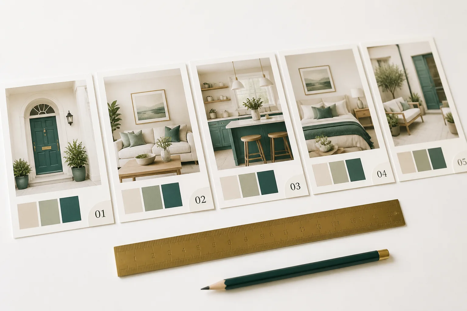
How the Eye Scans a Listing Gallery
Open any Etsy listing and watch what your own eye does. It lands on the main image first, takes in the whole composition in a glance, then, if interested, moves along the thumbnail strip of additional photos, sampling rather than studying. The buyer is not examining your gallery like a museum visitor. They’re scanning for confirmation that this product does the job, and they bail the instant the answer turns to “I’m not sure.”
That scanning behavior has two implications that shape everything below. First, composition within each image decides what the eye notices in the half-second it spends there, so each photo needs a clear focal point, not a busy scene the eye has to decode. Second, the order of the photos is a narrative the buyer moves through, and a good narrative builds momentum while a random pile of images lets it stall.
Visual hierarchy is the tool for both. Within an image, it directs the eye to what matters. Across the gallery, it sequences the images so each one answers the question the previous one raised. Done well, the buyer is carried from “what is this?” to “add to cart” without ever consciously deciding to follow.
The Job of Each Photo Slot
Etsy gives you up to ten image slots. Treat them as roles in a sequence, not as ten chances to show the same thing. Each stage has a job.
Hero (slot 1): stop the scroll, make the first impression
The hero does double duty: it’s your search thumbnail and your first in-listing impression. Its only job is to be the single most attractive, clearest image of the product, composed to read instantly at thumbnail size. This is not the slide for specs, heavy text, or clever angles. It’s the clean, confident shot that earns the click and sets the tone. Because it carries so much weight, it deserves disproportionate effort. Our thumbnail optimization guide goes deep on engineering the hero for the search grid specifically.
Context (slots 2–4 ish): answer the scale and setting question
Immediately after the hero, the buyer’s biggest unanswered question (especially for wall art) is “how will this look in a real space, at a real size?” Room mockups answer it directly: the print framed above a sofa, a bed, a desk, shown at believable proportions in a styled setting. These slots resolve the scale-uncertainty barrier that silently kills wall art sales, and they let the buyer picture the piece in their own life. This is usually where you spend the most slots. Which mockups answer which objection is the subject of our best mockups for wall art guide.
Detail (mid sequence): prove the quality
Once the buyer can see it in context, detail shots prove it’s worth buying: a close crop showing texture, line quality, or print sharpness. This answers the quality fear that mockups alone can’t fully address, confirming the file is crisp and considered rather than a low-effort upload.
Specs / what’s included (later slot): confirm the practicals
A clean slide listing the deliverables (file formats, sizes, resolution, what’s in the set) handles the practical buyer who needs to confirm they’re getting what they need. This is the right place for a small amount of text, because the slide’s job is information, not impression. For digital products especially, a clear specs slide removes a real objection.
Social proof / instruction (later slot): reassure and remove last doubt
Late in the sequence, a slide that reinforces trust (a tasteful note that delivery is instant, a simple how-to-print or how-to-download guide, or a styled set shot) settles the buyer who’s nearly convinced. It answers the last small “but how does this actually work?” before the buyer commits.
Focal Point and Contrast Within Each Image
Inside any single photo, the eye goes to the area of highest contrast and clearest focus. That’s the lever you use to control attention. In a hero or mockup, the framed print should be the clear focal point: sharp, well-lit, and set against a background that supports rather than competes with it. A busy, equally-weighted composition gives the eye nowhere to land, and an image with no obvious focal point reads as cluttered and amateur even when every element is individually fine.
Contrast does this work most efficiently. A print that stands out tonally from its surroundings reads as the subject instantly; one that blends into a same-toned wall or backdrop forces the eye to hunt. This is true even for soft, minimal styles: preserve one point of contrast so the focal point holds. The skill isn’t adding visual noise; it’s making sure the one thing that matters is the one thing the eye is pulled to.
The Rule of Thirds in Mockups
The rule of thirds is the simplest composition tool for making mockups feel professional. Imagine a three-by-three grid over the image and place the focal point (the framed print, the key detail) near one of the four intersections rather than dead center. Off-center placement reads as more natural and dynamic; the eye finds it more pleasing and is drawn to it more reliably than to a centered subject.
In room mockups this does extra work. Placing the framed print at a third leaves breathing room in the rest of the frame for the styled setting (the sofa, the plant, the light) which makes the scene feel like a real space the buyer could inhabit rather than a product pasted onto a backdrop. That sense of a believable life around the product is part of what triggers the buyer to imagine it in their own home.
Text Overlay Restraint
Text on listing images is a tool with a narrow correct use and a wide wrong one. The correct use: labeling a specs or what’s-included slide, a short clarifying benefit line on the hero, a clean instruction note. The wrong use: heavy text on every slide, overlapping the product, competing with the art for attention.
Restraint reads as confidence. A listing that lets clean imagery carry the weight, using text only to label and clarify, looks like the work of someone who trusts their product. A listing that plasters claims and badges across every image looks like it’s compensating, and it clutters the very composition you’re trying to keep clear. The von Restorff principle applies in reverse here too: when most listings are over-texted, the clean, restrained one stands out as premium.
The 200-Pixel Thumbnail Test
The hero (and ideally the whole gallery’s first impression) has to survive the shrink to search-thumbnail size. Reduce your lead image to roughly 200 pixels and view it among real competitors for your keyword. If the focal point still reads, the contrast holds, and the product is recognisable, it passes. If it goes muddy or the subject vanishes, no amount of full-size polish will recover the click you lose in search. This test is non-negotiable for the hero and worth running on any image meant to do persuasive work small.
Sequencing the Ten Photos for Momentum
Pull it together and the gallery becomes a sequence with momentum rather than a pile. The arc:
- Hero: stop the scroll, make the first impression. 2–4. Context mockups: answer the scale-and-setting objection, trigger the buyer picturing it in their space. 5–6. Detail: prove the quality.
- Specs / what’s included: confirm the practicals. 8–9. Additional context or styled variations: reinforce desirability.
- Social proof / instruction: settle the last doubt.
Each slide should answer the question the previous one raised and tee up the next, so the buyer’s confidence climbs as they scan. A gallery that opens strong then drops to weak, repetitive, or cluttered images leaks the momentum the hero earned. Order with intent, compose each image around a clear focal point, and the sequence does the persuading. For how this image strategy fits alongside titles, tags, and description, see our Etsy listing optimization guide.
Quick questions
Quickly answered.
Q.01What order should I put my Etsy listing photos in?
Lead with the hero: the cleanest, most attractive single image of the product, since it's both the thumbnail and the first thing clicked. Follow with context (room mockups showing scale and setting), then detail shots, then a specs or what's-included slide, and place a social-proof or instruction slide later in the sequence. The order should build momentum: stop the scroll, answer the scale objection, prove the quality, confirm the details, reassure. Each slot has a job, and the sequence carries the buyer from interest to confidence.
Q.02How many of my 10 Etsy photos should be mockups versus the product itself?
For digital wall art, lean heavily on context mockups (often half or more of the slots) because the scale-and-setting question is the biggest barrier and mockups answer it. Reserve one or two slots for the clean product image and detail, and one for specs. The exact mix depends on the product, but the principle holds: buyers need to see the item in a real context more than they need many angles of it floating on white.
Q.03Does the first listing photo matter that much?
It matters more than any other single element. The first photo is your search thumbnail, so it decides whether the buyer clicks in at all, and once they do it's the first impression that frames everything after. A weak hero loses the buyer before the rest of your gallery gets a chance. It's worth disproportionate effort and should be tested at thumbnail size against your actual competitors.
Q.04Should I put text on my Etsy listing photos?
Sparingly and purposefully. A small amount of text on a specs slide or to label a what's-included image helps, and a short benefit line on the hero can clarify. But heavy text overlay on every slide clutters the composition, fights the product for attention, and looks unprofessional. Let the imagery carry most of the weight; use text to label and clarify, not to decorate. Restraint reads as confidence.
Q.05How do I apply the rule of thirds to Etsy product photos?
Place the focal point of the image (the framed print in a room mockup, the key detail) near one of the intersections of an imaginary three-by-three grid rather than dead center. Off-center placement creates a more dynamic, natural composition that the eye finds pleasing and is drawn to. In room mockups this also leaves breathing space that makes the scene feel real and the product feel placed in a life rather than pasted onto a backdrop.
Keep going.
Color Psychology for Printable and Wall Art Design That Sells
Color psychology for printable design: how to use color to stop the scroll, read before style or price, and win the niche you're selling to on Etsy.
Social Proof and Trust Signals That Convert Etsy Digital Buyers
Digital buyers carry one fear: will the file even work? The trust stack and social-proof signals that answer it, and how to build them from scratch.
What Actually Makes People Buy Wall Art on Etsy
Wall art buyers aren't shopping for art, they're solving a problem. Understand the jobs they hire a print to do and your listings start converting.
300 DPI for Etsy: Why It Matters and How Elistit Handles It
Every Elistit output is 300 DPI. Why that resolution matters for Etsy printable sellers, and what happens when files fall short.