Color Psychology for Printable and Wall Art Design That Sells
Color psychology for printable design: how to use color to stop the scroll, read before style or price, and win the niche you're selling to on Etsy.
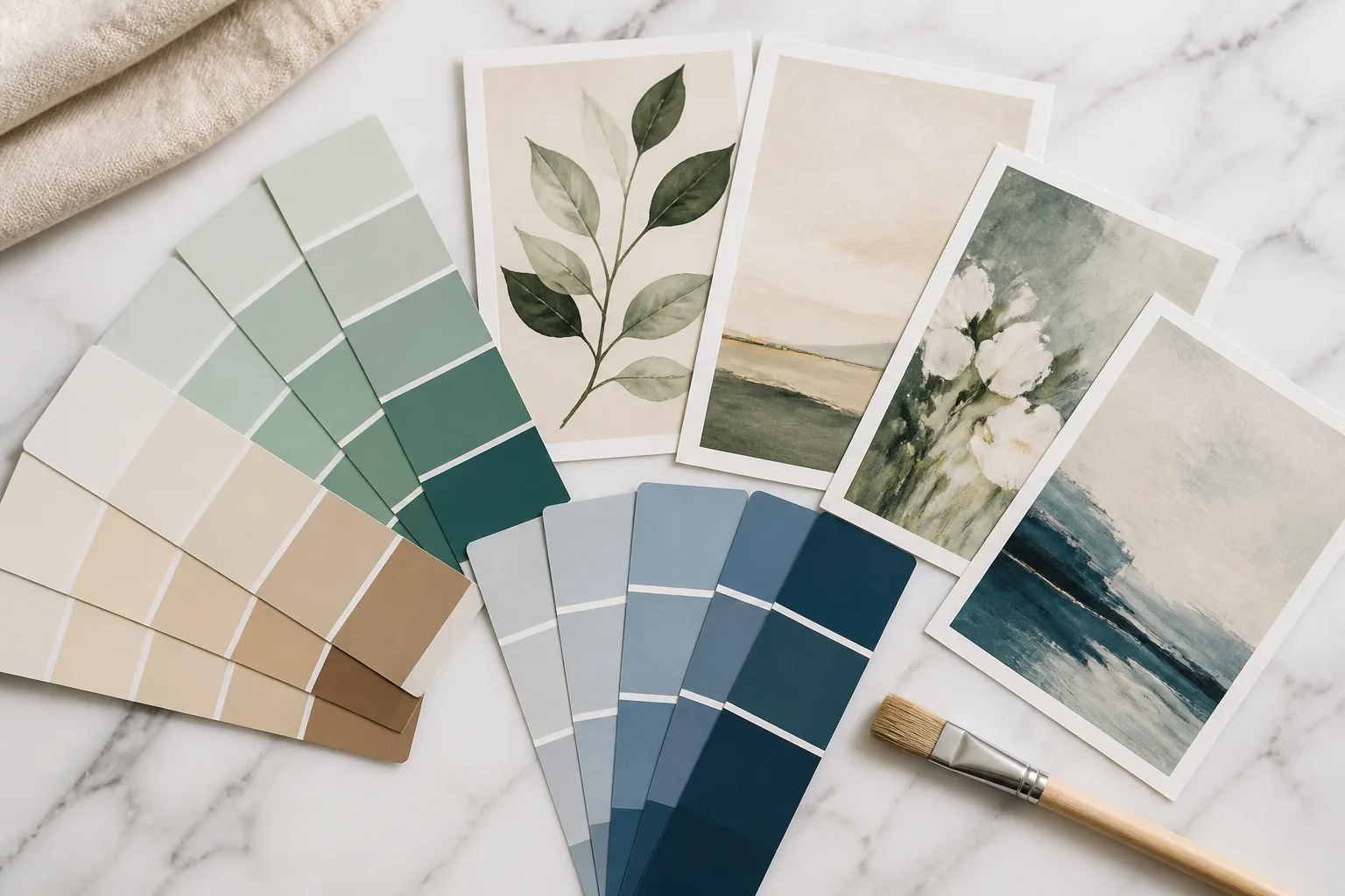
Color Is the First Thing the Buyer Processes
Before a buyer registers the style of your print, before they read the title, before they clock the price. They’ve already processed its color. Color is the fastest visual signal the brain handles, and on Etsy that speed is everything, because the buyer is scanning a grid of thumbnails at a rate measured in fractions of a second per item.
That makes color the first gate. A print that doesn’t win the color gate never gets the chance to win on anything else. The art can be exquisite, the SEO perfect, the price right, and none of it matters if the thumbnail’s color reads as muddy, flat, or invisible against its neighbors in the search grid.
So color does two distinct jobs, and strong printable design uses it deliberately for both. The first job is the scroll-stop: getting noticed in search. The second is the mood-match: signalling to the buyer that this print belongs to the room, the niche, and the feeling they’re shopping for. Get both right and color becomes your most efficient conversion lever.
Color and the Scroll-Stop
In a search grid, attention goes to whatever breaks the pattern. The von Restorff effect (the isolation effect) describes exactly this: the item that stands out from a uniform field is the one that gets remembered and clicked. Color is the easiest way to be that item.
Two properties drive the scroll-stop. Contrast is the first: a thumbnail with a clear difference between its focal element and its background reads instantly, while a low-contrast image asks the eye to work and the eye declines. Saturation is the second: in a grid dominated by washed-out or busy thumbnails, a cleanly saturated piece pops; in a grid of loud saturated competitors, a calm, confident piece can be the one that stands out by contrast of approach.
The lesson isn’t “use more color.” It’s “use color that differs from what’s around it.” If a niche’s search results are a sea of pale neutrals, a single piece with a confident accent stops the scroll. If the results are chaotic and busy, a clean, restrained piece does. Standing out is relative to the field, which is why studying the actual search grid for your keyword matters more than any abstract color rule. Our thumbnail optimization guide covers how to engineer that scroll-stop in the slot that decides whether you get a click at all.
Palettes by Niche and Buyer Mood
The mood-match job is where color associations earn their keep. The buyer isn’t shopping for a color in the abstract. They’re shopping for a feeling that fits a space, and certain palettes carry certain feelings reliably enough to build a niche around.
Calm neutrals: nursery, bedroom, minimalist
Sage green, warm cream, soft beige, muted terracotta, dusty blush. These read as calm, safe, soothing, which is exactly what a buyer decorating a nursery or a bedroom wants the room to feel. The nursery buyer in particular is shopping for serenity and gentleness; loud saturation actively works against the job. Minimalist buyers want the same restraint for a different reason: visual quiet as a lifestyle signal. In these niches, the winning move is often desaturation and a tight, harmonious palette rather than contrast for its own sake.
Saturated and bold: maximalist, eclectic, statement art
Here the buyer wants the opposite. Maximalist and statement-art buyers are decorating to express, to fill a room with personality and energy. Rich jewel tones, bold contrasts, unexpected color pairings: these signal confidence and individuality, and a timid palette reads as a failure to deliver the job. In this niche, the scroll-stop and the mood-match align: bold color both stands out in search and satisfies the buyer’s actual desire.
Muted and soft: coastal, Scandinavian, vintage
Desaturated blues, sandy neutrals, soft grays, faded greens. The coastal buyer wants the airy, sun-washed calm of the seaside; the Scandinavian buyer wants understated, functional warmth; the vintage buyer wants the gentle fade of age. These palettes share a quality: they pull saturation down to feel relaxed and lived-in. The design skill here is keeping the muted palette from going flat in the thumbnail, which usually means preserving one point of contrast even within the soft scheme.
The throughline across all three: match the palette to the buyer’s mood and the room’s job, not to your personal taste. The same print in the wrong palette for its niche doesn’t get bought.
Cultural and Seasonal Associations
Color meaning isn’t fixed, and treating it as universal costs sales when you sell across markets and seasons.
Seasonal demand shifts are sharp and predictable. Warm oranges, deep reds, and golds spike in autumn. Soft pastels rise in spring. Rich greens, reds, and metallics own the winter holidays. A shop that rotates seasonal palettes (or seeds them ahead of demand) catches buyers shopping with the calendar, while a static palette misses those waves entirely.
Cultural associations matter the moment you sell internationally. White signals purity and weddings across much of the West but mourning in parts of East Asia. Red reads as luck and celebration in Chinese contexts and as warning or passion elsewhere. If your audience is broad, the safe path is palettes built on widely shared associations; if you’re targeting a specific market, tune the palette to that market’s meanings rather than assuming your own. This is judgment, not a lookup table, but ignoring it entirely is a leak.
The Thumbnail-at-200px Reality
Every color decision has to survive the shrink. Etsy displays your listing image as a small thumbnail in search, and that’s where the buy-or-skip decision actually starts. A palette that sings at full resolution can collapse at 200 pixels: subtle gradients turn to mush, low-contrast pieces vanish, busy color schemes become noise.
Build the 200-pixel test into your process: shrink the image to search size and view it among real competitors for your keyword. Ask whether the focal area still reads, whether the contrast holds, whether the piece stands apart from the grid. If the art becomes unidentifiable or the colors muddy, the design fails the only test that determines whether the buyer ever clicks in. Strong thumbnail color means a clear, contrasting focal area that holds its shape when small, a principle that applies whether your style is bold or minimal, as our minimalist wall art design guide shows even restrained work has to clear.
Building a Recognisable Shop Palette
Color also does long-game work: it builds a shop identity. The mere-exposure effect means buyers come to prefer what feels familiar, and a consistent color signature across your listings is one of the fastest ways to manufacture that familiarity. A buyer who keeps seeing your distinctive palette in search starts to recognize your shop before reading the name. Recognition lowers perceived risk, which raises clicks and repeat browsing.
A recognisable palette doesn’t mean every print is the same colors. It means there’s a coherent family (a signature range of tones, a consistent saturation level, a recurring accent) that makes your shop read as one designed aesthetic rather than a scattered assortment. That coherence signals professionalism and intention, both of which buyers reward with trust.
The discipline is choosing a palette family that fits your niche’s mood, stands out in your niche’s search grid, and survives the thumbnail shrink, then holding it across listings so it compounds into recognition. Color, used this deliberately, stops being decoration and becomes positioning. It pairs directly with your keyword strategy, since the palette that wins the niche visually should match the niche you’re optimizing for. See our Etsy SEO for wall art guide for aligning the two.
Quick questions
Quickly answered.
Q.01What colors sell best for printable wall art on Etsy?
There's no universal best color. There's a best color for the buyer's mood and niche. Calm neutrals (sage, cream, warm beige, soft terracotta) dominate nursery, bedroom, and minimalist niches. Saturated, high-contrast palettes win in maximalist, eclectic, and statement-art niches. Muted, desaturated tones own coastal and Scandinavian styles. The mistake is picking a color you like instead of the color the buyer is searching with their eyes.
Q.02Why does color matter so much in Etsy search results?
Etsy search is a grid of small thumbnails scanned in a fraction of a second. Color is the fastest visual property the brain processes, faster than shape or text, so it's the first thing that either stops the scroll or doesn't. A thumbnail with strong contrast or a distinctive, on-trend palette gets noticed; a low-contrast or muddy one disappears into the grid no matter how good the underlying art is.
Q.03Should every listing in my shop use the same colors?
Not the same colors, but a recognisable palette family. A consistent color signature builds familiarity through the mere-exposure effect: buyers come to recognize and prefer your shop's look as they encounter it repeatedly across search and your shop page. This doesn't mean every print is identical; it means your shop reads as one coherent aesthetic rather than a random assortment, which raises trust and repeat browsing.
Q.04Do color associations change by season or culture?
Yes, and ignoring it costs sales. Seasonal palettes shift demand sharply: warm oranges and deep reds in autumn, soft pastels in spring, rich greens and gold around the holidays. Cultural associations vary too: white signals purity in much of the West but mourning in parts of Asia, and red carries luck in Chinese contexts but warning in others. If you sell internationally, the safest palettes lean on broadly shared associations or are tuned to the specific market you're targeting.
Q.05How do I know if my colors work at thumbnail size?
Apply the 200-pixel test: shrink your listing image to roughly the size it appears in Etsy search and look at it among competitors. If the colors go muddy, the contrast collapses, or the piece blends into the grid, it fails regardless of how it looks full-size. Strong thumbnail color reads as a clear, high-contrast focal area that survives the shrink. If you can't tell what the art is at that size, the buyer can't either.
Keep going.
Social Proof and Trust Signals That Convert Etsy Digital Buyers
Digital buyers carry one fear: will the file even work? The trust stack and social-proof signals that answer it, and how to build them from scratch.
Visual Hierarchy in Etsy Listing Photos: Guiding the Eye to the Buy
Your ten Etsy listing photos are a sequence, not a gallery. How to order them and compose each one to move a buyer from curiosity to the buy.
What Actually Makes People Buy Wall Art on Etsy
Wall art buyers aren't shopping for art, they're solving a problem. Understand the jobs they hire a print to do and your listings start converting.
300 DPI for Etsy: Why It Matters and How Elistit Handles It
Every Elistit output is 300 DPI. Why that resolution matters for Etsy printable sellers, and what happens when files fall short.