Etsy Thumbnail Optimization for Digital Products: What Converts
How to create Etsy thumbnails that get clicked: the specs, the composition rules, and what the best-selling digital shops do differently.
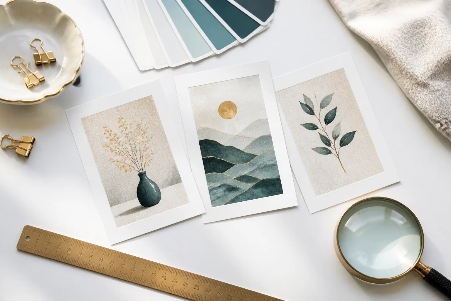
Good keywords get your listing in front of a buyer. Your thumbnail is the only thing that decides whether they click.
At the moment a buyer scans a page of 48 results, they’re not reading titles; they’re scanning images. They’ll spend less than half a second per thumbnail before moving on or clicking. Every choice in your listing photo (composition, background color, contrast level, text placement) happens or fails in that half-second window.
Most Etsy sellers treat thumbnails as documentation of their product. High-converting sellers treat them as ads.
Technical Specs (Get These Right First)
Etsy displays thumbnails at roughly 200×200px in search results and up to 570×456px on listing pages. Upload at:
- Minimum: 2000×2000px, square (1:1 aspect ratio)
- Recommended: 3000×3000px, which gives more cropping flexibility if Etsy trims edges on certain devices
- Format: JPEG or PNG. For thumbnails with no transparency, JPEG at 85% quality is fine and loads faster. PNG only if you’re working with a transparent overlay element.
- File size: Keep under 1MB. Etsy compresses on upload anyway, but bloated source files slow your admin and don’t improve quality.
- DPI: Irrelevant for web display; 72 DPI is fine. Don’t confuse this with your print file specs; the listing photo and the downloadable file are separate. (See the 300 DPI guide for print file requirements.)
The 1:1 ratio matters because Etsy crops non-square images to fit the thumbnail grid. A portrait orientation (taller than wide) will be cropped on the sides. A landscape thumbnail gets cropped top and bottom. Design for square from the start, or at minimum ensure your primary subject is centered within the safe zone.
How Buyers Scan the Search Grid
The Etsy search results page is a dense 4-column grid on desktop, 2 columns on mobile. Every listing gets exactly the same real estate. When a buyer lands on that page, their eyes don’t move systematically; they jump to whatever has the strongest visual anchor.
Visual anchors, in order of pull strength at thumbnail scale:
- Faces and human figures: the eye goes there first, always
- High contrast: a dark image next to light images, or a vivid color on a neutral grid
- Simple, clear subject: one thing, clearly readable, in a defined context
- Text: large, short text reads at 200px; dense text becomes gray noise
What doesn’t work as a visual anchor:
- A complex scene with multiple competing focal points
- A white product on a white background surrounded by other white-background listings
- A collage of 4–6 small images tiled into one thumbnail
- Thin or decorative fonts at small sizes
The practical implication: if your first photo is a technically perfect shot of your print on a white background, and the listings around you are showing prints styled in living rooms and nurseries, you’re going to lose the click. White backgrounds communicate “I don’t know how to present this product” when everyone else has context.
Test this: open Etsy and search your primary keyword. Look at the top 20 results. Note the background colors. Note what percentage show products in real settings vs. isolated. Your thumbnail needs to be distinct from the cluster, not identical to it.
The 4 Thumbnail Types That Work for Digital Products
1. Interior Scene Mockup
The product printed and framed, hanging on a real or staged wall. Often includes a partial view of the room: a chair, plant, furniture edge, or floor. This is the strongest performer for wall art and printables because it answers the buyer’s first question (“what will this look like in my space?”) before they’ve clicked.
Effective interior mockups have: warm or neutral wall color with enough contrast to show the print, natural or soft artificial light, enough room context to establish scale without the room competing with the product.
Elistit generates up to 20 listing images per listing (mockup variants plus shop-branded slides) (room settings, flat lays, and styled vignettes), so you can pick the strongest one for photo 1 and use the others in positions 2–4.
2. Product-on-Surface Flat Lay
The print laid on a physical surface (wood, linen, stone, marble) with minimal props. This works well for bundles (a set of prints fanned out) and for demonstrating scale (a ruler or common object alongside the print). Less immersive than an interior scene but faster to produce and often cleaner for complex multi-file products.
Keep props minimal: 2–3 items maximum. The product should occupy at least 60% of the frame. Watch for shadows that obscure the artwork.
3. Styled Lifestyle Photo
The product in a fuller lifestyle scene: a styled desk, a reading nook, a gallery wall arrangement. Higher production value and storytelling potential than a flat lay, but requires more creative direction to pull off. Works well for specific buyer segments (nursery art, home office decor) where the lifestyle context directly matches the buyer’s self-image.
Don’t use a lifestyle photo as your thumbnail unless the product is clearly identifiable at 200px. If the scene is beautiful but your artwork is a tiny rectangle in the background, you’ve lost the click.
4. Text-First Stylised Preview
For products where the artwork itself is text-based (quote prints, affirmation posters, lettering), lead with a clear render of the main text at high contrast. Black text on cream, white on a deep background, or the branded color palette of the print itself.
Add a single short label at the top or bottom edge (“Printable Wall Art” or “Instant Download”) in a clean sans-serif at around 48–60pt at 2000px. This helps buyers self-select in search without cluttering the main event.
What to Avoid
Collages of many small images in one thumbnail. Four prints tiled 2×2 in a single image look compelling at 1000px. At 200px they become a gray blob. If you want to show multiple prints, use an interior scene that features 2–3 of them on the same wall.
Heavy watermarks. A logo in the corner is fine. A diagonal “SAMPLE” across the image, or text repeated across the entire artwork, signals distrust and reduces perceived quality. Digital buyers know they’re not getting a high-res preview; you don’t need to belabour it.
Stock model photos where the model’s face is the focal point. The buyer wants to see the product, not a generic lifestyle model. If a person appears, they should be secondary to the product or shown using it in a natural way (e.g. reading a print, decorating a wall), not posed looking at the camera.
Generic white backgrounds for wall art. White backgrounds have a place (clean product shots for stickers, transparent elements) but for wall art they remove all context. The buyer can’t tell if the print is 8×10 or 24×36, whether it’ll look right in a bright room or a dark one, or whether the style fits their space. Every unanswered question is a reason not to buy.
A/B Testing Your Thumbnails
Etsy doesn’t have a native A/B test tool, but you can run a simple split test manually:
- Note your current listing’s views, favorites, and CTR in Stats for a two-week baseline.
- Create a duplicate listing with only the thumbnail changed. Keep everything else identical: title, price, tags, description.
- Run both listings simultaneously for 2–3 weeks with low-budget Etsy Ads (equal budgets, ~$1/day each) to get comparable impressions.
- Compare CTR (clicks ÷ impressions) from Etsy Ads reporting. This is a cleaner signal than organic because you control for position.
- Kill the lower-performing listing, update the winner’s thumbnail, and deactivate the test.
Two things to control for: don’t test in a period that overlaps with a seasonal shift (pre-Christmas vs. January behave quite differently). Don’t change the price between the two test listings; price affects conversion and muddies the CTR signal you’re testing.
If you’re using Elistit’s mockup generation, you’ll have 15 thumbnail candidates to choose from per listing; run the ones that look most distinct against each other, not minor variations of the same composition.
The Full Listing Photo Sequence
Photo 1 through 10 each do a specific job. Think of it as a short sales page, not a gallery.
- Photo 1 (Thumbnail): Win the click. Interior scene or strongest mockup. Clear subject at 200px.
- Photo 2: Second mockup, different room context or orientation. Shows the product scales well.
- Photo 3: Flat lay or close-up detail. Shows artwork quality and color accuracy.
- Photo 4: Bundle or set overview; show all files included. For single prints, show a size comparison.
- Photo 5: File format graphic. “What you’ll receive: 5 JPGs + 1 PDF, sizes 8×10, 11×14, 16×20, A4, A3.”
- Photo 6: Print instructions or mockup showing printed result. “Print at home or send to a print shop.”
- Photo 7: Usage rights. One-sentence visual: “Personal use + home printing. No commercial resale.”
- Photo 8: FAQ slide. “Instant download, no physical item shipped. Files available immediately after purchase.”
- Photo 9: Color and style variant overview (if applicable). “Also available in dark, sage, and blush.”
- Photo 10: Brand or shop trust signal. Shop name, 5-star rating, review count, “100+ happy buyers.”
Not every listing needs all 10 slots. Photos 1–6 are the essential sequence. Photos 7–10 reduce purchase anxiety and increase conversion rate on listings where buyers hesitate.
The Etsy listing optimization guide covers the full listing structure (descriptions, attributes, and pricing) that sits behind the photos.
Quick questions
Quickly answered.
Q.01What size should Etsy listing photos be?
Etsy recommends 2000×2000px minimum with a square aspect ratio (1:1) for thumbnail display. A 2000×2000px image at 72 DPI is the standard. Higher resolution (3000×3000px) gives more cropping flexibility for different display contexts.
Q.02How many photos should an Etsy digital product listing have?
Aim for 6–10 listing photos. Photo 1 (thumbnail) is your search result image; make it stand out. Photos 2–4 should show the product in use (mockups). Photos 5–7 cover specs, formats, and usage rights. Photos 8–10 handle FAQs visually.
Q.03Do lifestyle mockups perform better than plain product images on Etsy?
Yes. Interior scene mockups (product on a wall, in a room) consistently outperform white-background product shots for printables and wall art. They help buyers visualize scale and context, reducing uncertainty and increasing conversion.
Q.04What makes a high-converting Etsy thumbnail?
Strong contrast, readable text (if any) at thumbnail scale, a clear single subject, and enough white space that the image doesn't compete with itself. Avoid collages of 6+ small images in a single thumbnail; they become unreadable at 200px.
Q.05Should I add text to my Etsy thumbnail?
Sparingly. A single short line (the niche or style name, e.g. 'Minimalist' or 'Boho') can help buyers self-select from search results. Avoid pricing, URLs, watermarks, or multiple lines of text; they reduce the visual impact at small sizes.
Keep going.
300 DPI for Etsy: Why It Matters and How Elistit Handles It
Every Elistit output is 300 DPI. Why that resolution matters for Etsy printable sellers, and what happens when files fall short.
AI Art on Etsy: Understanding Policies and Best Practices
Etsy's AI art policy in plain English: disclosure rules, quality expectations, and how to ship compliant listings without losing your artistic voice.
Using AI Art Responsibly on Etsy
Everything Etsy sellers need to know about AI-generated art: disclosure policy, quality standards, and building a sustainable shop alongside AI assistance.
AI Upscaling for Etsy Printables: Built into Every Workflow
AI images are too small to sell as prints. Why 4x to 8x upscaling is needed for 300 DPI print files, and how it fits a digital art workflow.