Colors Look Different on Etsy Than in Your Design? Here's Why and How to Fix It
Art looks dull, dark or off-color in the Etsy preview? It's almost always a color profile mismatch. Export in sRGB, soft-proof, and set expectations.
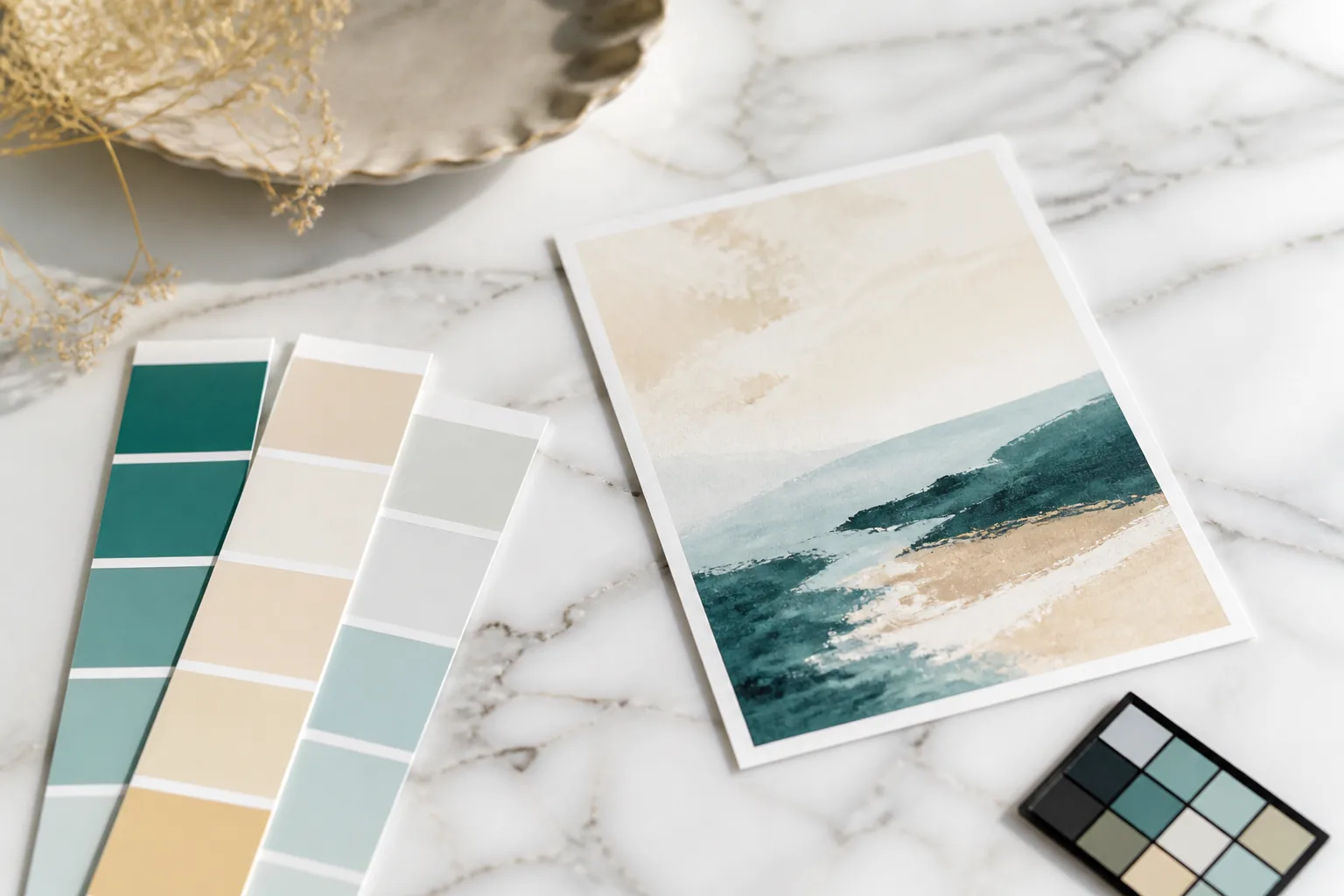
If your art looks dull, dark, or color-shifted in the Etsy preview compared to your design file, the cause is almost always a color profile mismatch: you exported in a color space that Etsy and browsers do not honor. The fix is to export in sRGB, every time.
The Fast Fix
Re-export your image with the color profile set to sRGB IEC61966-2.1 and the option to embed the color profile turned on. Re-upload. In the vast majority of “colors look wrong on Etsy” cases, the preview now matches your design.
That is the whole fix for screen-preview color. The deeper, separate issue (print color differing from screen) is about managing reality and buyer expectations, covered below.
Why Colors Shift: The Cause
Browsers and Etsy’s image pipeline assume sRGB. sRGB is the standard, narrowest common color space; it is what virtually every screen and web surface is built around.
When you export in a wider color space (Adobe RGB, ProPhoto RGB) or in CMYK, two things happen:
- If no profile is embedded, the browser interprets your wide-gamut numbers as if they were sRGB. Saturated colors get pulled inward and the image looks dull, muddy, or desaturated.
- CMYK files look especially flat and dark in web previews because the conversion path is wrong for screen display entirely.
This is why your file can look vivid in Photoshop (which honors the wide profile) and dull on Etsy (which does not). The pixels did not change. The interpretation did.
The Fixes, In Order
Fix 1: Export in sRGB, always
In Photoshop: Edit → Convert to Profile → sRGB IEC61966-2.1, then File → Export As with “Embed Color Profile” checked. In Affinity, Canva, and most tools, set the document or export color profile to sRGB.
Never ship Adobe RGB, ProPhoto, or CMYK to an Etsy buyer. sRGB is the only safe choice for both the web preview and the buyer’s eventual print. See print-ready file specifications for the full export checklist alongside DPI and format.
Fix 2: Soft-proof before you publish
Soft-proofing simulates how the file will look once printed, so you catch problem colors early. In Photoshop: View → Proof Setup → Working CMYK (or a specific paper profile), then View → Proof Colors. Watch for bright blues, vivid greens, and neons collapsing. Those are out-of-gamut and will disappoint in print.
If a color shifts badly, nudge it slightly toward what the proof shows before a buyer ever prints it. For most muted, pastel, or earthy palettes, this step confirms you are fine. For saturated work, it saves refunds.
Fix 3: Set buyer expectations in the listing
Print color will differ slightly from screen no matter what you do. That is physics, not a defect. Pre-empt it with a calm, standard note:
“Colors may vary slightly depending on your monitor calibration and your chosen printer or print service. For the most accurate results, we recommend a quality home printer or a professional print shop.”
This single line resolves most would-be color complaints before they happen, because it reframes variation as expected and normal.
Fix 4: Rule out monitor calibration
If colors look “off” only to you and buyers are happy, your monitor may be uncalibrated or in a vivid/cool display mode. Before redesigning anything, view your file on a second device or a phone. If it looks right there, the issue is your screen, not your file.
How to Convert to sRGB in the Most Common Tools
The exact steps differ by app, but the goal is identical everywhere: the file should be sRGB and carry an embedded sRGB profile.
- Photoshop: Edit → Convert to Profile → Destination “sRGB IEC61966-2.1”. Then File → Export As (or “Save for Web”) with “Embed Color Profile” / “Convert to sRGB” checked.
- Affinity Photo / Designer: Document → Convert Format / ICC Profile → sRGB IEC61966-2.1, then export with “Embed ICC profile” enabled.
- Canva: Canva works in sRGB and exports sRGB by default. Issues here usually come from importing an Adobe RGB or CMYK asset into Canva. Convert source assets to sRGB before importing.
- Procreate: Set the canvas color profile to sRGB at creation. Changing it later requires flattening and re-exporting.
- Lightroom: When exporting, set Color Space to sRGB (not Adobe RGB or ProPhoto RGB).
If you only fix one thing, make it this: never export in Adobe RGB, ProPhoto RGB, or CMYK for an Etsy product.
A Quick Pre-Publish Color Check
Run this 60-second check before any listing goes live:
- Open the exported file in a plain web browser (drag it into a Chrome or Safari tab). Browsers display sRGB. If it looks right here, it will look right on Etsy.
- View it on a second device (your phone) to confirm it is not your monitor.
- For saturated art, soft-proof in your editor (next section) and confirm no colors collapse.
If steps 1 and 2 agree, your color is correct and any remaining difference is your own screen calibration, not the file.
Why Print Color Differs From Screen, and How to Message It
Screens emit light and mix color additively (RGB). Printers absorb light and mix color subtractively with ink (CMYK on paper). The two gamuts do not fully overlap. Bright, glowing blues and neon greens exist on screen but cannot be reproduced in ink at all.
So the goal is not a perfect screen-to-print match (that is impossible for certain colors). The goal is:
- Stay mostly inside the printable gamut (avoid pure neons in art meant to be printed).
- Export sRGB so the preview is honest.
- Tell the buyer, plainly, that slight variation is normal and recommend a good print service.
Manage expectations and you turn a potential one-star “colors were off” review into a non-issue.
How Elistit Keeps Color Consistent
Elistit’s pipeline exports in sRGB at 300 DPI by default, so what a buyer sees in the Etsy preview matches the file they download, with no wide-gamut or CMYK surprises. The color you approve is the color that ships. For the resolution side of print fidelity, see the 300 DPI guide.
Quick questions
Quickly answered.
Q.01Why do my colors look washed out or dull on Etsy?
Almost always a color profile mismatch. You likely exported the file in Adobe RGB, ProPhoto RGB, or CMYK. Etsy and web browsers assume sRGB and do not honor wide-gamut profiles, so saturated colors get clipped and the image looks dull or shifted. Re-export in sRGB and the preview will match your design.
Q.02Should I use sRGB or CMYK for Etsy digital downloads?
Always sRGB. CMYK is for commercial offset printing and looks muddy in every web preview and most home and print-on-demand printers, which expect sRGB and convert from it. Exporting CMYK files is one of the most common avoidable causes of color complaints and refunds on Etsy digital products.
Q.03Why does my print look different from my screen?
Screens emit light (additive RGB) and printers lay down ink on paper (subtractive), so some screen colors (especially bright blues, greens, and neons) simply cannot be reproduced in ink. The fix is not to chase a perfect match but to soft-proof, avoid out-of-gamut neons, and set buyer expectations with a short color-accuracy note in your listing.
Q.04What is soft-proofing and do I need it?
Soft-proofing is a preview mode in Photoshop or Affinity that simulates how your file will look when printed, so you can catch colors that will shift before a buyer does. It is worth doing for any art with intense, saturated tones. For typical muted or pastel palettes, exporting clean sRGB is usually enough.
Q.05How do I tell buyers colors may vary without scaring them off?
Add a short, calm line in the listing: 'Colors may vary slightly depending on your monitor and printer settings.' It is standard, reassuring, and it pre-empts the most common color complaint. Pair it with a note recommending a quality print service for best results. This frames variation as normal, not a defect.
Keep going.
Why Your Etsy Thumbnails Look Blurry or Pixelated (And How to Fix It)
Blurry or pixelated Etsy thumbnails are almost always resolution and crop. The exact dimensions, causes and checks to get sharp listing images.
Etsy Digital File Too Large? How to Shrink Files Without Losing Quality
Hit Etsy's 20 MB per-file limit on a digital download? Compress, convert to PDF, or split the bundle while keeping your art at full 300 DPI quality.
How to Make Etsy Mockups Look Realistic (Not Obviously Fake)
Realistic Etsy mockups start with perspective, lighting, scale and shadow, so wall art looks like it's hanging in a real room, not pasted onto a wall.
How to Watermark Etsy Listing Previews Without Ruining the Look
Watermark your listing images, never the buyer's file. How to protect previews with a subtle mark that won't kill conversions, and what it can't stop.